The Food and Drugs Authority (FDA) has rebranded with the introduction of a new logo, key visuals and brand guidelines aimed at updating its corporate image to emotionally and visually entrench itself to stakeholders.
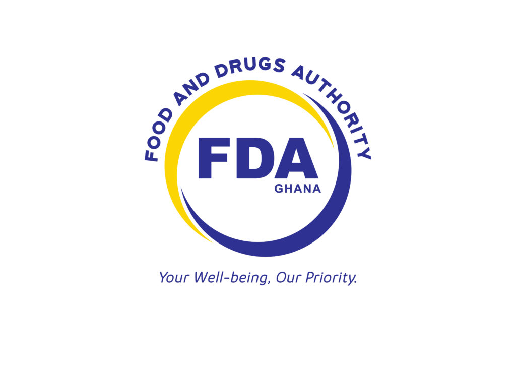
The logo consists of two arcs in yellow and blue which form a circle around the acronym, “FDA”, which is also spelt in full in the shape of an arc above the circle.
The interlocking arcs symbolize the FDA’s willingness to embrace engagement with stakeholders. The full circular shape of the arcs represent the complete 360 required checks the authority conducts to ensure consumer wellbeing.
Within the circle, “Ghana” sits beneath the A of FDA to specify the geographical location of the brand.

The Authority’s new tagline is empathetic and compelling which sits boldly under the lower arc forming a part of the logo.
Together with its bold brand colours, the new logo carries a sense of authenticity and warmth with the colour palette fully representing its corporate identity.
“We saw our 20 years anniversary last year as a great opportunity to refresh our commitment and for a new more responsive, proactive, dynamic and consumer- accessible FDA to be at the heart of our new brand identity,” the CEO of the Authority Delese Mimi Darko said at the unveiling ceremony of the new FDA on Tuesday.
According to her, the current FDA logo has an old look and feel and they wanted the new logo to at least convey everything the FDA stands for (not just food and medicines – capsule and plate).

The rebranding, she said will position the FDA as an evolving dynamic brand that moves with the times and remains relevant in a changing business environment and that it will also help reflect the repositioned FDA stance of being a social brand that is human from inside out. An institution that is human-centred and quality focused.
“In the end, we want to achieve a social connection with Ghanaians; we want to give the brand a new look and outlook, and we want to make the brand relevant in the ever-changing market environment.
“Rebranding means rededicating the FDA to improved and effective regulation to ensure transparency, equity and prioritization of the wellbeing of Ghanaian citizens.
“Where the FDA logo appears on a product, people must be assured that the product is of the right quality and safe and where the FDA logo appears on a name tag people must know to be assured that the bearer can be trusted to deliver excellent service in a timely manner,” she stated.
The Health Minister Kwaku Agyeman-Manu charged the Authority to relook at advertisements especially, on herbal medicines saying: “It is worrying that almost every radio or TV stations do air advertisement on herbal and I wonder whether those adverts have been approved by the FDA in view of the claims that are made within those adverts. Let us remember that advertisements are very influential and have the potential of affecting listeners positively or negatively. Therefore, a misleading advertisement can have serious repercussions. “
He again called on the Authority to ensure effective post-market surveillance so as to ensure that regulated products on the market are safe, efficacious and of good quality in spite of the porous borders that we have in this country.
Source: Ghana/Starrfm.com.gh/103.5FM


